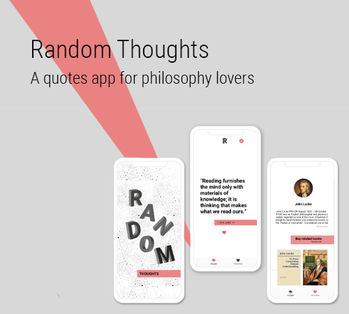
The developer I normally work with, a philosophy lover, couldn’t find a good quotes app on the market focused on philosophy.
A full stack developer and myself as product designer.
Sketch, Invision, pen and paper.
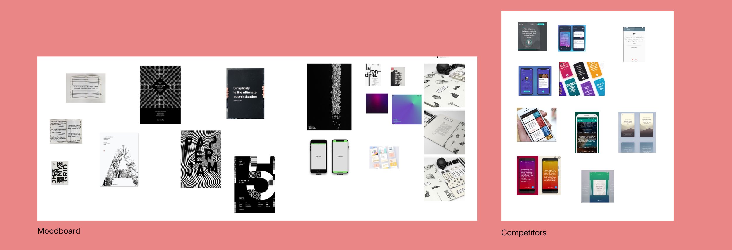
We researched competitors, to have an idea of what it was out there in terms of functionality, usability, UI and business model.
This gave us a good idea of what we would consider a MVP, what we would like to be differentiated from etc.
I created a document with screenshots of competitors apps and visual design inspiration from not just apps but anything I found would help me in developing the UI. We wanted the app to be minimalistic, to give importance to the text so I looked for typographic and minimal designs.
At the same time we started selecting authors and quotes that we wanted to include in the first release of the app.
After doing research looking at competitors' apps and seeing what they were offering in terms of features, what was most common between them, and our business goals (selling books), we decided how the MVP would look like. This had to include:
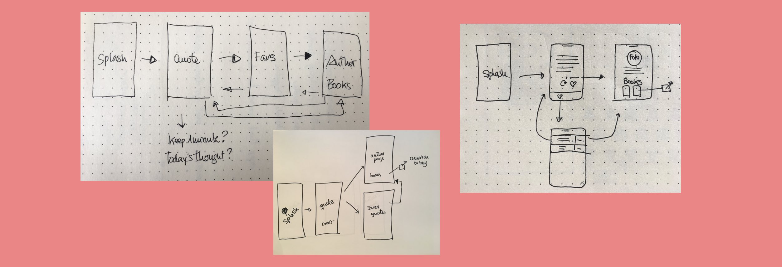
Having set up the I started thinking about the user flow, exploring the most natural and easy way to explore the app.
I made many sketches, brainstorming all the ideas that came to mind together with the developer, this way together we could explore many different ways of displaying everything.
Sketching was a great way to define the user flow, the number of screens and how the user would interact with them.
We were ready to move to start coding and designing the UI.
The way we worked together was a mix of sending assets through Zeplin and pairing
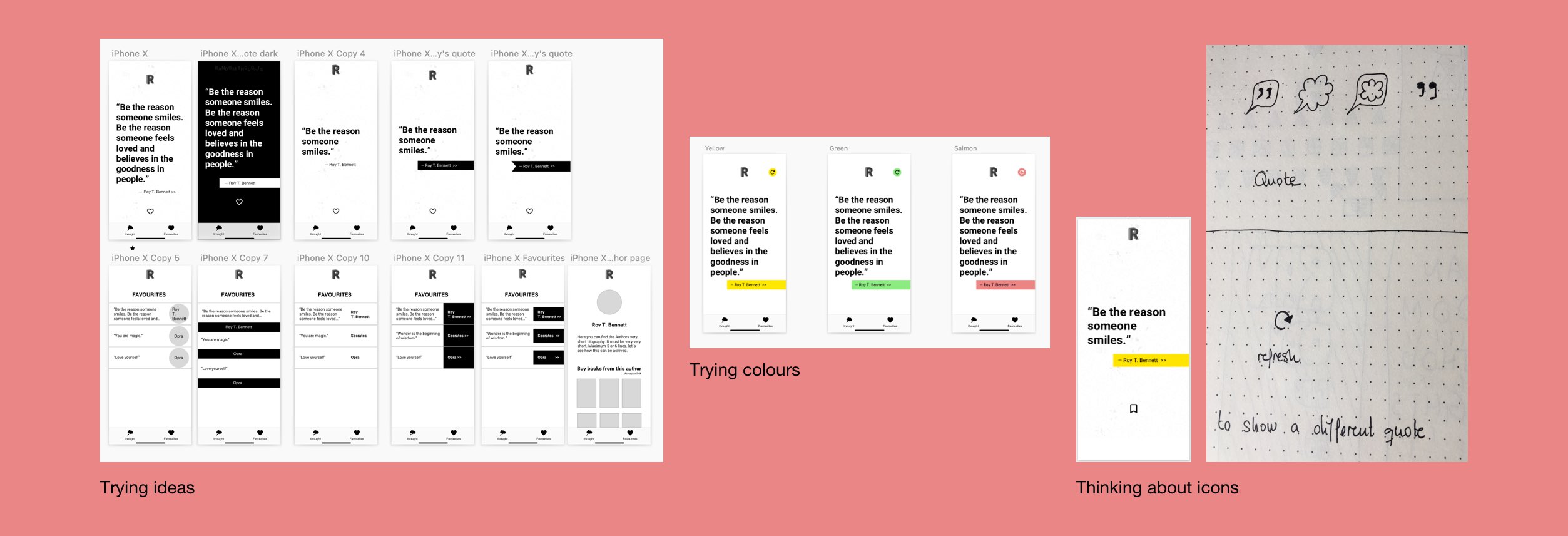
I started doing low fidelity wireframes in sketch that evolved rapidly into a more comprehensive UI. With Sketch capabilities it was easy to iterate and try ideas.
I wanted the UI to be very typographic, mainly black and white with just an accent colour. So I started designing everything black and white and then tried some colours.
I tried for it to be platform agnostic so it could work well in both android and IOS. For that I did a good research trying to find common elements in their guidelines.
As soon as I had something I shared it with the developer via Zeplin so we could be developing and designing at the same time, checking how everything worked with real code in real devices as soon as possible.
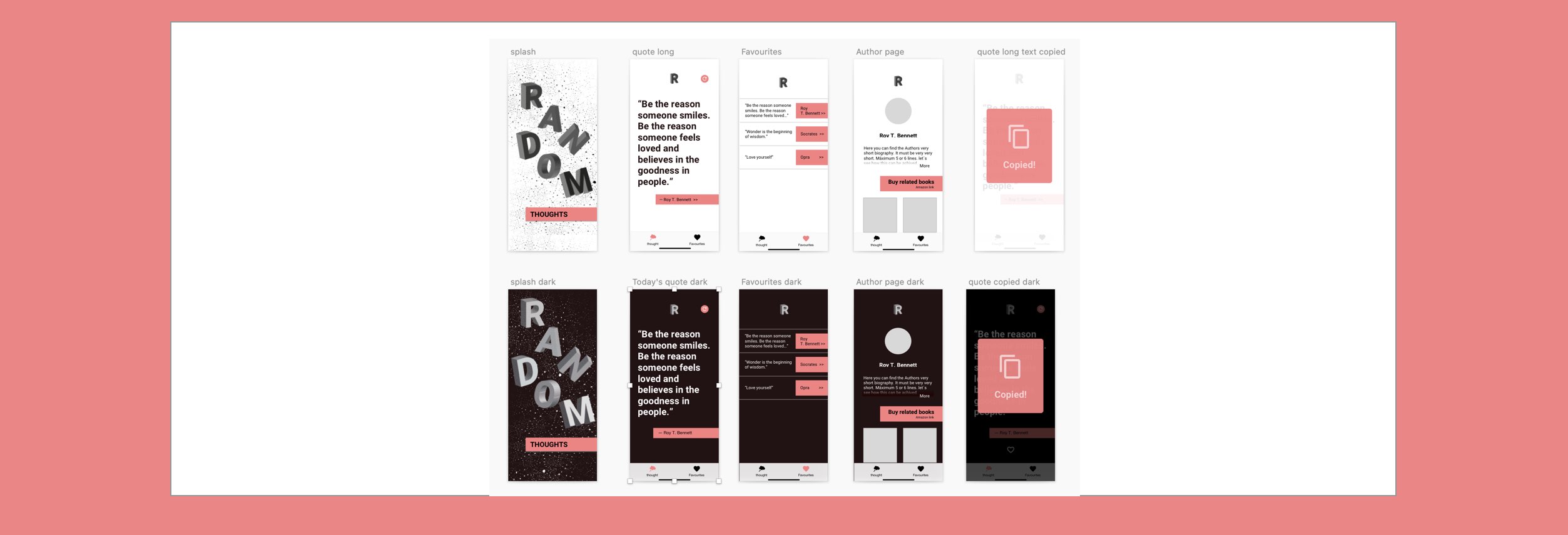
We also had an Invision prototype that was constantly updated so we could visualise the whole project and its interactions. You can find the lastest version of the prototype here.
We mainly wanted to find out if the users recognise the app as a quotes app, if they knew how to save, find the saved quotes, find out about the author and if they knew how to see a differente quote.
When we had the first working iteration of the app I tested it on 3 users, and one of them tested the app in 4 different devices.
This usability testings were very useful as we confirmed the flow worked well with the users, they navigated without problems and the icons we were using also worked well. Also we found out some problems as the way the books were laid out (very close to the bottom of the page) made the users think there were more books and kept trying to scroll down to see more.
Also we got valuable feedback from the users as how they were expecting to see the app blending with the notification bar in some devices, something I didn't considered at that point and we could see how long strings of text were behaving in small/large screens, so we had to change some font size to accommodate to all different screen sizes.
After fixing everything we did a quick test with another person and we were confident that all was working ok now.
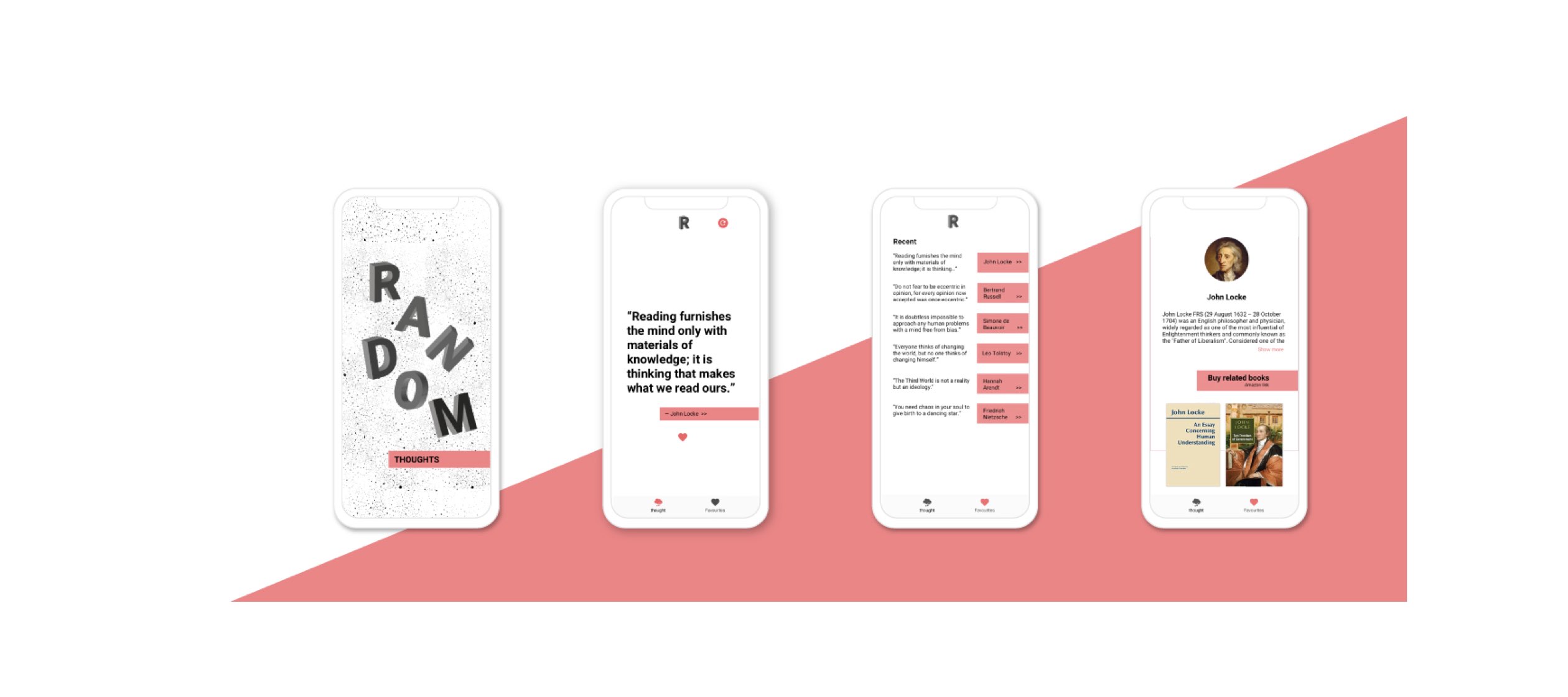
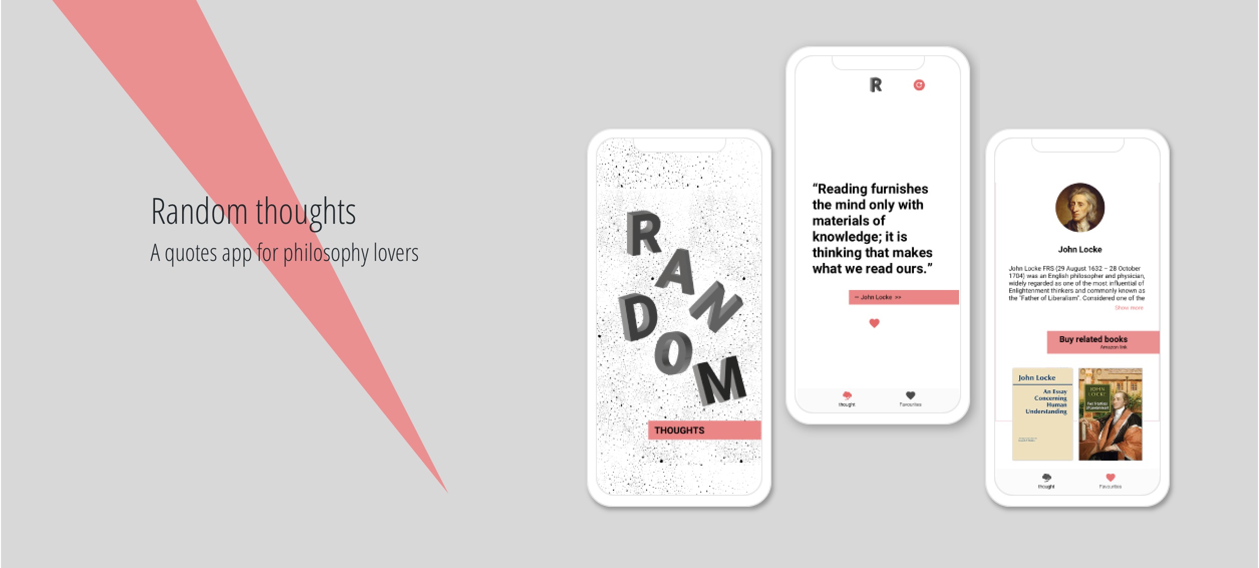
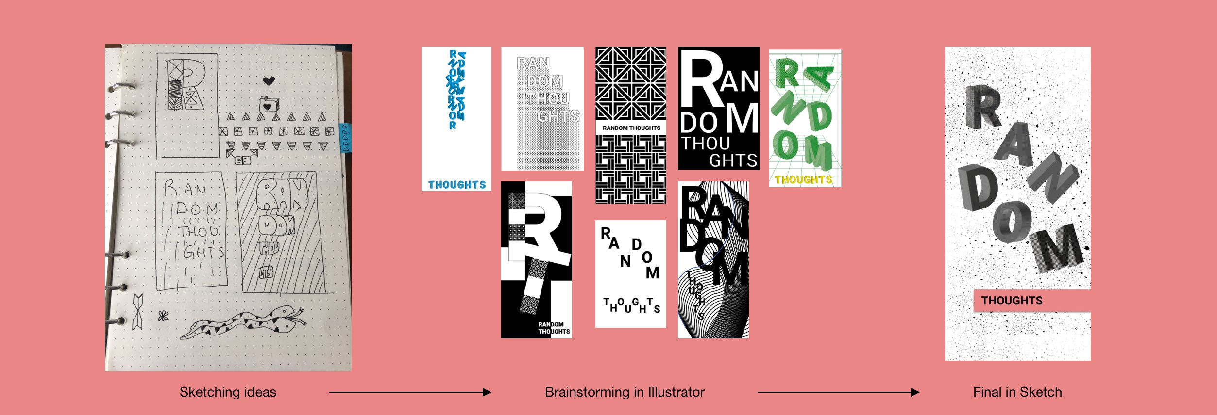
After testing and fixing the usability problems I worked on the final touches of the design, mainly the splash screen, logo and some small details like the colour of the show more link and some font sizes.
Because the design of the app was very minimalistic I wanted to contrast it with the splash screen. I had several ideas for it and at the end I made some 3D letters "floating into space" for the word Random, and added a common UI element in the word Thoughts, the salmon strip used in displaying authors' names.
Having a MVP well defined.
Moving quickly, testing and iterating on final product.
Team work, taking decisions and working together. Great communication.
We could have done some previos research on the need of an app this type by doing some research or a smoke test.
You can check the app at the Google Play Store here