Thunderstorm - Cinema marketplace

Thunderstorm provided a selection of apps and services for cinemas looking for management products or searching to engage more with their audiences

Background

About product

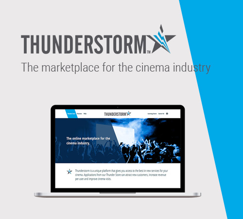
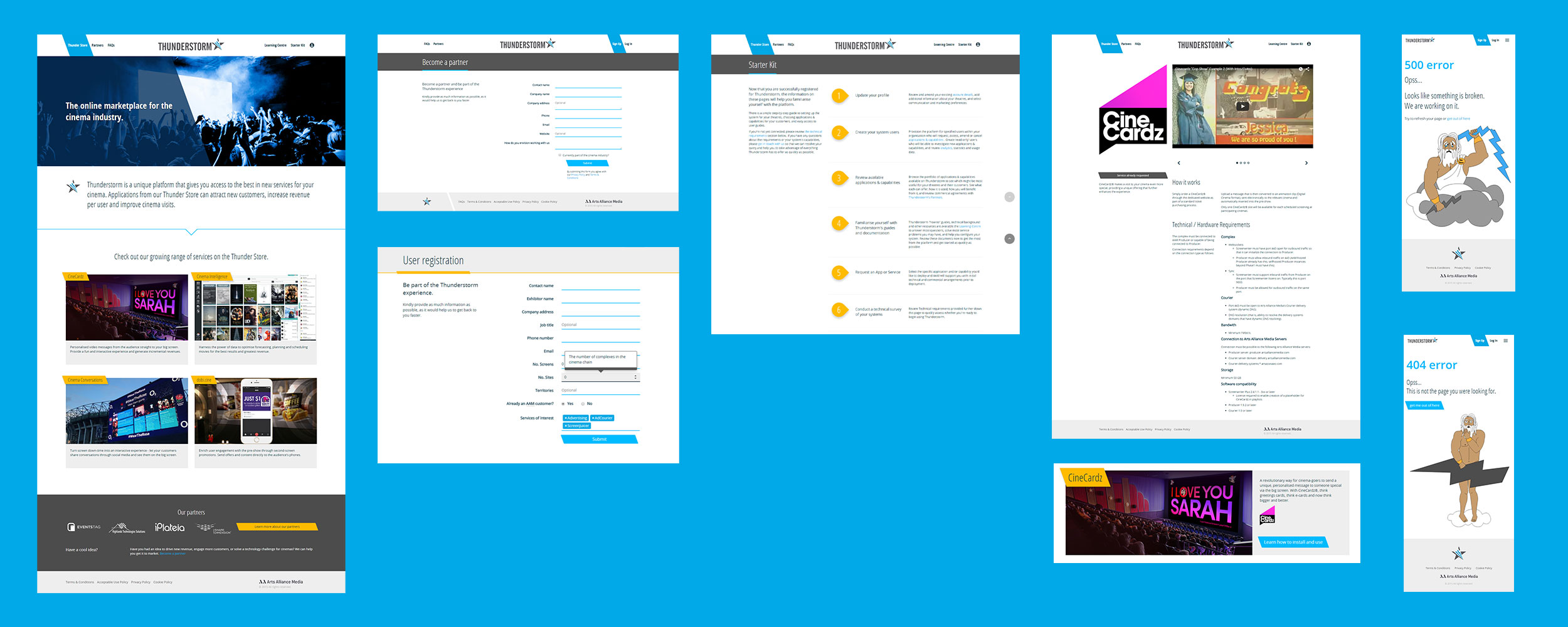
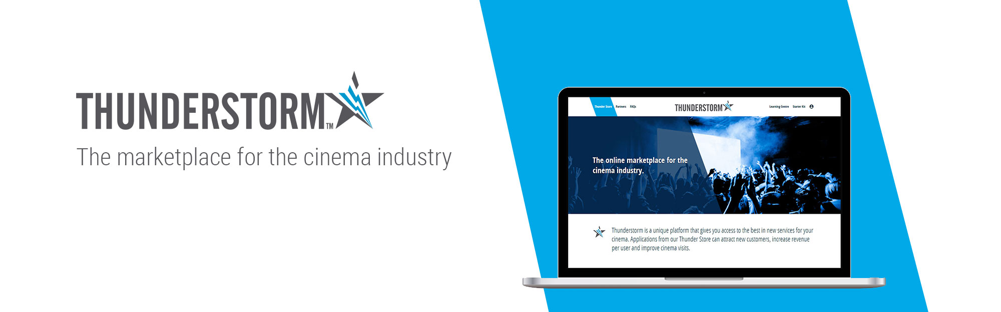
A very innovative greenfield project for the cinema industry where cinema managers would be able to find apps and software to manage their cinemas and engage their audience.

The team

A cross-functional team with 3 backend developers, a QA, a product manager, a product owner and 2 designers which were also the front end coders.

My role

UX/UI designer / Front End developer.
I worked on the first phase of the project until the delivery of the MVP.

Initial challenges

  • No other similar product existed in the industry
  • Very tight timeframe to deliver
  • Had to be extremely easy to use and understand

What would we call success

  • Easy onboarding
  • Responsive portal where desktop and mobile design was priority.
  • Prompt delivery of the product in time to present it on international fair.

Discovery Phase

Initial requirements

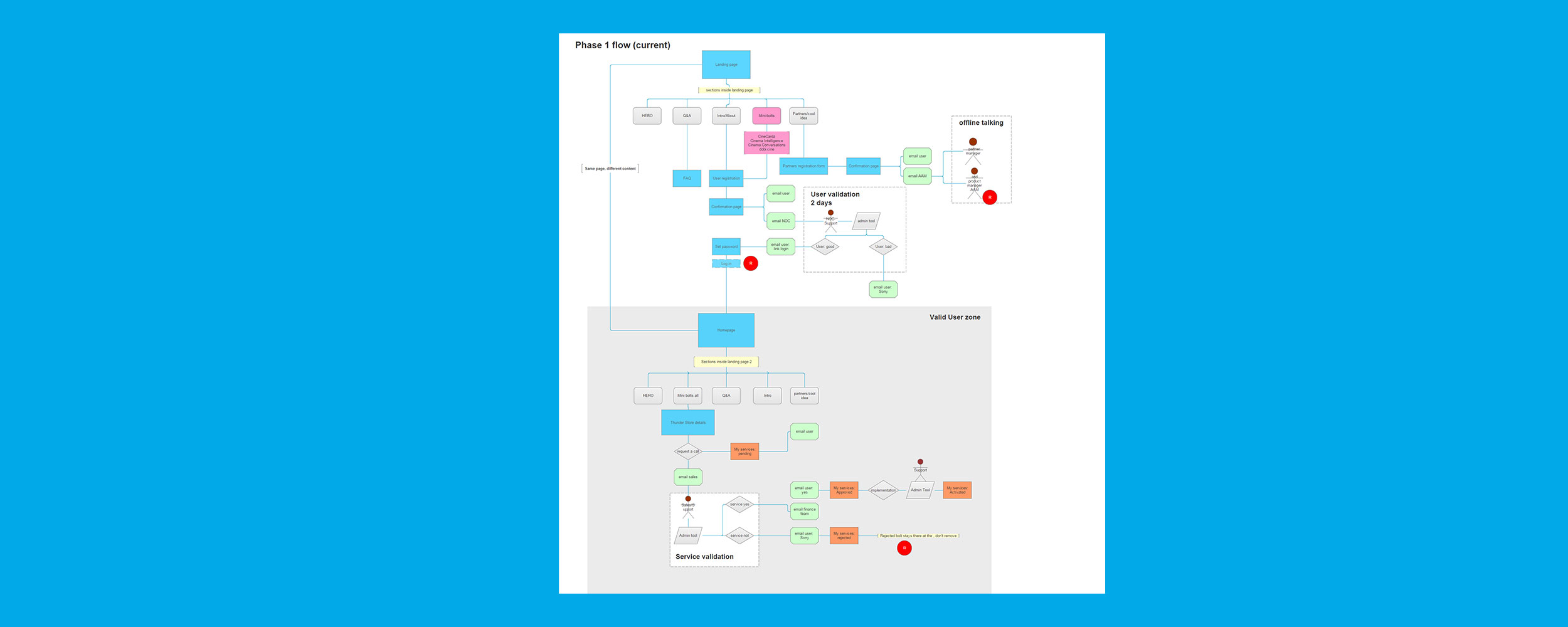
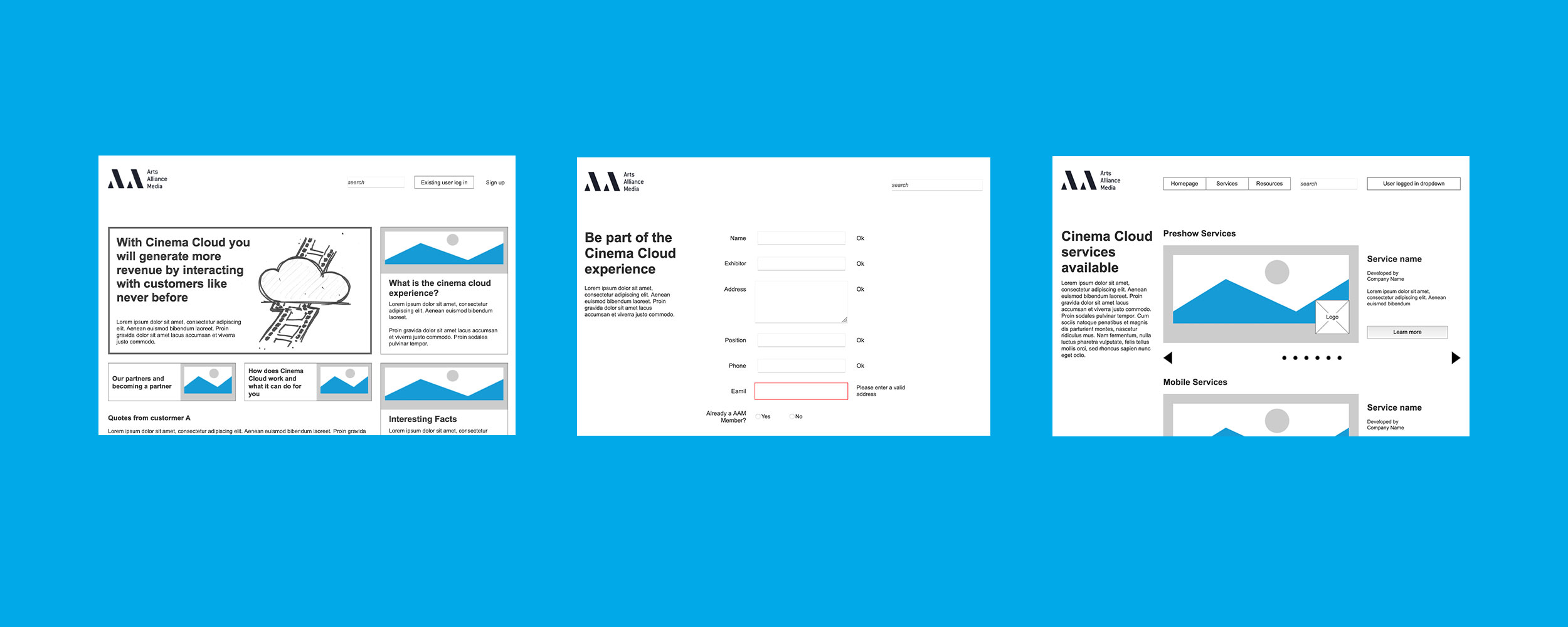
PM explained the idea behind the project and we started working on a user journey map.

User journey

We created the user journey map to gather all the requirements. This proved to be an essential tool for team discussions about the way to deliver the product and defining the MVP.

User Journey

user journey map

Kicking off

Wireframing

  • In the design team, we translated the requirements in the user journey to low fidelity wireframes.
  • Because we decided to make the initial wireframes in a prototype in Axure we had better conversations with stakeholders and the rest of the development team.
  • Through some iterations these wireframes evolved to a more solid structure where we started testing and thinking more about visual design.
wireframes and prototype

Visual Design

Team effort

At the design team we were in constant communication to develop a consistent visual language. We would give eachother feedback, agree on decisions and own the visual design.

UI modular style guide

Based on atomic design principles, we designed and coded and online modular style guide that grew with the project. This component library was key for our success on delivering on time a consistent product.

Modular Style Guide

Modular Style Guide

Accessibility

From day 1

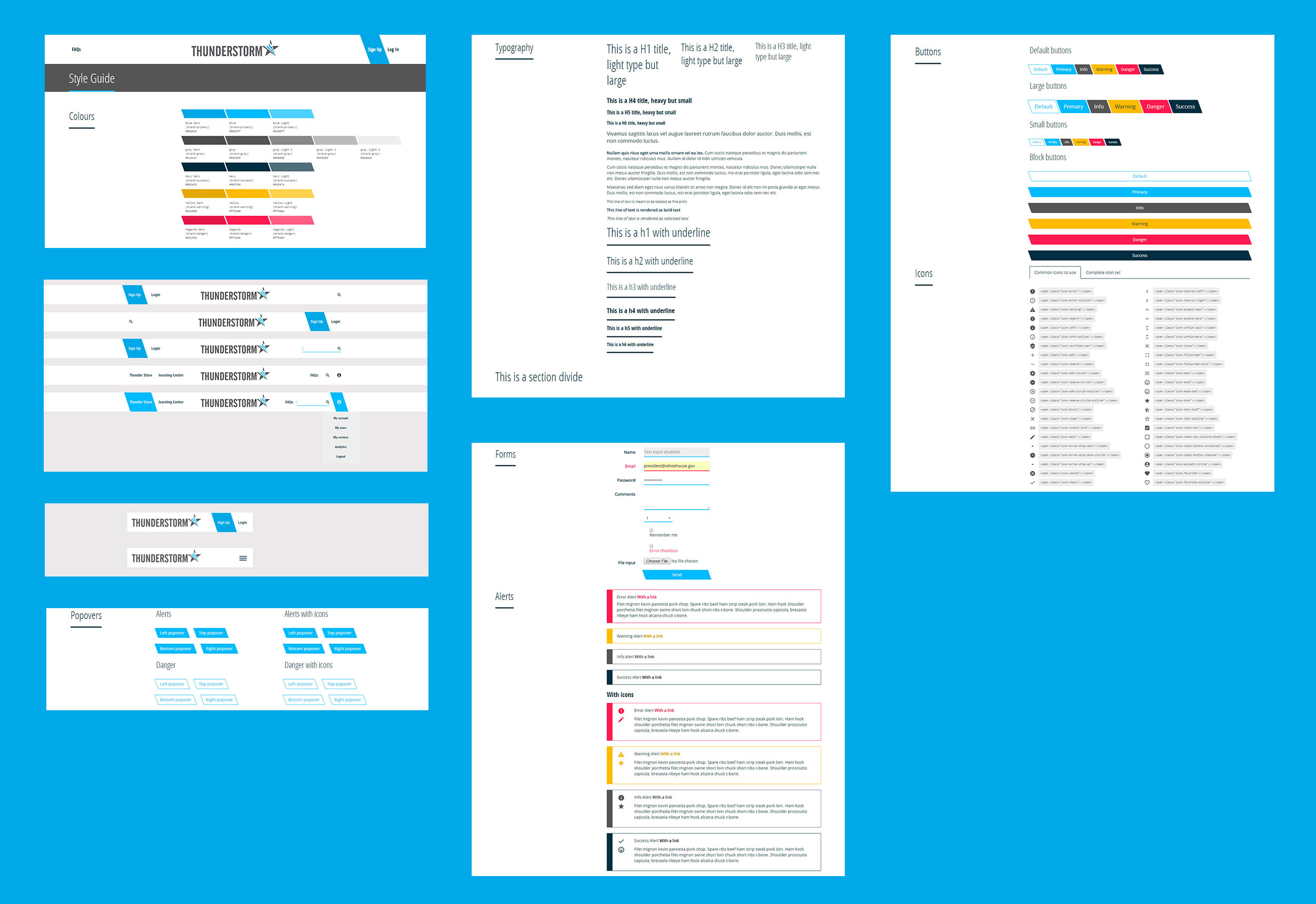
Since the beggining we wanted to be sure we would design and code with accessibility in mind.

Accessibility checks

Some of the things we were taking into consideration whilst designing and coding:

  • To use plain language, it should be easy to read, understand and scan.
  • To be able to navigate using keyboard.
  • Be sure to use semantic HTML and good content structure to help screen readers.
  • Good colour contrast throughout the design
  • Good size font - we would also check how the layout would look when increasing it.

Evaluative research

Testing

We tried to test the platform as much as possible within the restrains of the project, as it wasn’t public we had to limit our testing to participants from different departments of the company, unaware of this project.

Findings

For example, in one of the testings we made, at the beginning of the project, we uncovered issues with the copy, it was initially provided by a copywriter and was too long. The participants wouldn’t read it and was difficult to understand what the product was about. The solution was rewriting the copy ourselves to a more simpler and shorter version of it, iterating on it until it was easy to understand.

UI

UI assets

We delived the product on time for the international fair where it won an award for "Most innovative product of the year".

Learnings

On what went well

  • Great team collaboration was key to success.
  • A realistic MVP agreed between everyone involved.
  • Worked on a modular styleguide from the beginning made very simple to create new pages, sections and repeat patterns.

To be improved

  • Because of the secrecy of the product at that point we couldn't do more research to validate specific ideas with cinema managers, the end user.
  • Although we put emphasis on accessibility we didn't test for it.